
Analyzing Covid-19 Shelter-In-Place Effects for Tennessee and Hamilton County
Author: Josh Patterson
Date: April 22nd, 2020
Intro: "A Tale of Two Infection Patterns"
In this report we examine how Covid-19 infection rates in Hamilton County, TN and then the wider state of Tennessee, were affected by the Shelter-in-Place order issued by the Govenor of Tennessee on April 2nd, 2020.
In our first report on Covid-19 data we forecasted positive counts for Hamilton County across the month of April based on the Tennessee state growth rate. This report looks at how the growth rate of Covid-19 in Tennessee has changed as a result of the shelter-in-place actions taken on April 2nd, 2020.
Disclaimers
This report was created by Patterson Consulting as an informational analytical exercise. No healthcare bodies nor goverments are endorsing this report.
Patterson Consulting does not employ any epidemiologists, but we do analyze data and provide forecasts for Fortune 100 companies[Other Initiatives].
Assumptions, Approach, and Caveats
Many models have tried to forecast Covid-19 on a per-state level and have had issues with accuracy due to multiple factors such as:
- many aspects of Covid-19 are not yet well understood
- once dire forecasts came out, many people begin to self-isolate, therefore social-distancing was already being implemented inherently. This effect changes the in-flight conditions the original forecasts were made based on.
- as more data came online, models were updated
For some background reading on infection models, check out this slideshow on the SIR model from a class at CMU.
Modeling Covid-19 peaks and timelines will likely continue to be difficult until we have captured enough reliable data about its spread rate, infection mechanics, and other attributes. It's worth noting that "data acquisition" in this context will likely have a high cost as we have to live through the ups and downs daily until we have enough data to better contain the virus.
For this analysis of the Shelter-in-place order from April 2nd in Tennessee, we decided to analyze two windows:
- The first 5 days of the shutdown window
- The last 10 days of the shutdown window
Using CDGR as a Growth Measure
We switched to Compounded Daily Growth Rate (CDGR) in this case as its a simple analytical way to express how a variable is growing over time. It's difficult at this stage to fit a model for covid-19 on each county as we don't have a good handle on what the specifics for Covid-19 are, and that makes the SEIR-class curves bounce around a lot. Other difficulties for covid-19 include as explained to me in an email exchange with an epidemiologist:
"SEIR (Susceptible, Exposed, Infected, Recovered) is predicated on person-to-person transmission. However it is clear that the SARS CoV 2 in addition to person-to-person spread is also transmitted via environmental mechanisms – namely fomites (surfaces) and droplet nuclei that are airborne. The virus appears to have a significant half-life on surfaces such as metal, plastic for several days, cardboard for several hours, and airborne droplet nuclei for possible 1-2 hours while suspended in air. Hence, even with social distancing without masking – infected individuals can still spread the virus and not be in the immediate area where another susceptible person can ‘pick-up’ the virus."
So for now we'll stick with CDGR as it seems to be effective to measure near-term infection growth in observed data. It's worth noting that CDGR does not take into account the longer-term dynamics of a formal infection curve model. This means that while CDGR is a decent near-term growth modeling tool, there is a point on the horizon at which it does not take into account the SEIR-class models tail-dynamics.
Data Sources
Raw data analyzed is from the daily data being pulled from
- The Covid Tracking Project, TN data archives
- The Tennessee state website for Covid-19 reported statistics
Tennessee Geographical Location of New Covid-19 Positive Tests, April 1st to April 17th
To set context for this report, in map below we visualize the total new covid-19 detections in Tennessee on a per-county level.
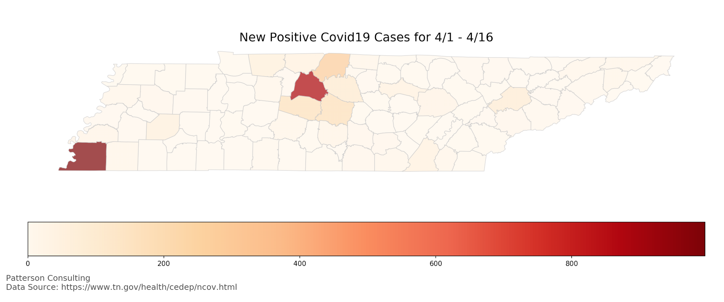
As we can see in the image above, Shelby County (Memphis) and Davidson County (Nashville) are both hot spots for new Covid-19 infections in the state of Tennessee for the month of April through the 17th. The embedded spreadsheet below has the full dataset.
Tennessee Observed Reaction to Shutdown
In the embedded spreadsheet below, we should calculations for the entire state of Tennessee.
In the analysis above we see only a difference of 0.02 between the initial "delay window" of the shelter-in-place order and then "cooldown window" later in the month. However, this masks dyanmics that play out on the county level as we note the map above showing a wide variance of new infections for the month across counties. Let's now look at a few specific counties to get a better idea of what happened.
Hamilton County Observed Reaction to Shutdown
In the embedded spreadsheet below we can see the observed data across the shelter-in-place order for Hamilton County, TN.
We note we're missing 2 days of data in the above model, so we hand calculated approximations based on the CDGR for that part of the shelter-in-place window.
Further we can see the embedded graph below that shows the total cases per day over the time window of April 1st to April 17th.
Analysis of Hamilton County Shutdown Window Data
Analysis of the data and graph above for Hamilton County's shelter-in-place directive:
- There appears to be an inflection point in the graph on 4/7/2020
- Covid patients tend to exhibit symptoms around 5 days after initial infection [reference here]
- Likely we're seeing the lag-effects of patients testing positive across the 5 days into the window
- The daily compounding growth in the lag window comes is calculate to be 0.11
- Post inflection point, we see the daily compounding growth lower to 0.02 over the remainder of the window
(For a replay of the April projection with the observed CDGR of 0.11, check out the footnote section.)
How did the Shelter-in-Place Affect Nashville and Davidson County?
We can see the calculations in the embedded spreadsheet below.
Analysis caveats:
- We're missing more days for Davidson County, because I was not downloading and tracking every county's daily stats before 4/13/2020 (I only had a few spot days).
- However, we can still compute the same CDGR windows as CDGR only needs the start value, the end value, and the count of time periods (days, here)
Davidson County analysis:
If we use the same date windows, we see a similar "tale of two windows"; the difference between the two CDGR windows is nearly the same as Hamilton County (0.14 - 0.05 == 0.09), despite starting and ending with higher numbers.
How did the Shelter-in-Place Affect Smith County?
In this section we analyze a "middle of the pack" Tennessee county to better understand how different types of counties experienced the shelter-in-place order from a covid-19 perspective. For reference, Shelby County, TN, has a population of 19,942 for 2020. We can see the calculations for Shelby County's shelter-in-place analysis in the embedded spreadsheet below.
Shelby County only had 3 at the beginning of the month, and then rose to 11 cases by the end of the month. Less populus rural counties have conditions that are less conducive to infection spreading. This is a potential explanation for the observed data.
Another observation here is that the CDGR numbers for the early / late windows do not show the CDGR slowdown as we saw in both Hamilton County and Davidson County. This could also expain why Tennessee's CDGR windows were more "muted" as a state as compared to specific areas of higher Covid-19 infection.
Looking at Change in CDGR for all Counties
In the table below we compute the two CDGR windows for every county in Tennessee.
Observations
The top 10 most infected counties (as of 4/16, denoted by the red line in the spreadsheet) showed an average CDGR drop between the two windows of 0.074. For the data shown, counties with 30-40 or more at the start of the month represent the group of counties with the largest impact by growth rates of the infection. This group's infected population had gotten to the size where a month of compounding growth tended to make a difference in the count by the 16th [revise].
There were some middle of the pack counties that had more than 25 infections by the 16th but less than 100.
The counties below the green line in the spreadsheet represent counties that still only have 25 or less infections by the 16th of the month.
The CDGR drop would be most relevant for the top 10 counties (in stopping infection growth) and less so for the counties outside the top 10.
Summary, Analysis, and Moving Forward
In this report we examined how Covid-19 infection rates in Hamilton County, TN and then the state of Tennessee, were affected by the Shelter-in-Place order issued by the Govenor of Tennessee on April 2nd, 2020.
In the larger more populated top 10 counties (e.g., Davidson, Shelby), there are higher infection counts. These counties tend to also be more populated as well. These counties tended to react positively to the 15-day shelter-in-place order based on the slowdown (0.074) in their infection rate CDGR. Given the average top-10 county (by infection cumulative) was compounding daily by a factor of 0.12, a drop of 0.074 was non-trivial (62% drop reduction) in slowing down the infection CDGR.
However, 69 counties (73% of all counties, largely rural) in the state of Tennessee had 25 infections cumulative or less as of 4/16. With relation to the changes in CDGR, for infection totals under 25 cumulatively in rural regions of the state the change in CDGR did not either to be that large or seem to have much effect.
Based on the above data we suggest that there may be a "tale of two infection patterns" at work in Tennessee;
For the top 10 counties, the growth is compounding fast enough that a shelter-in-place is effective. For the bottom 69 counties, it was much less effective especially considering the cost involved.
Footnotes
Footnote: [Other Initiatives]
Other tangentially relevant Patterson Consulting initiatives:
- Analytics work supporting research at the University of Michigan on ICU admissions during disasters
- Smart city analytics support for the University of Tennessee at Chattanooga's CUIP group (see our previous article on analying PM2.5 air quality data)
What would have happened in Hamilton County in April with no shutdown?
Footnote: April Re-ProjectionTo build the forecast below, we use the CDGR observed leading up to shutdown period (0.11). We make the assumption that it is safe to assume we'd hit "at least" this number in April as a mild flu season affects 7.4% of the population. The population of Hamilton County for 2020 is 364,286 and based on the 7.4% flu infection total, that would affect 29,957 people in Hamilton County.
Therefore we feel its reasonable to assume based on observed characteristics of Covid-19 so far that without reduced contact the virus would follow a CDGR of 0.11 and infect around 1000 people in Hamilton County in April.